Gabi Dall'Agnol
PT / EN

Industry

Food and Drink

Client

Amaterasu (fictional)

Year

2019

Amaterasu


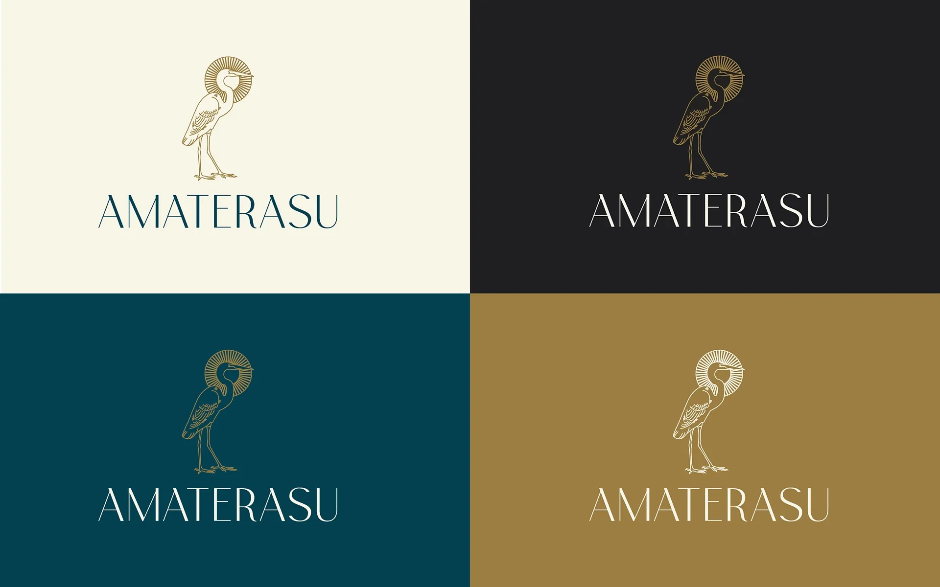
Amaterasu brand mark, with a heron symbol drawn in a style inspired by Japanese art.

Concept

A self initiated project, developed as part of my own exploration of brand design.

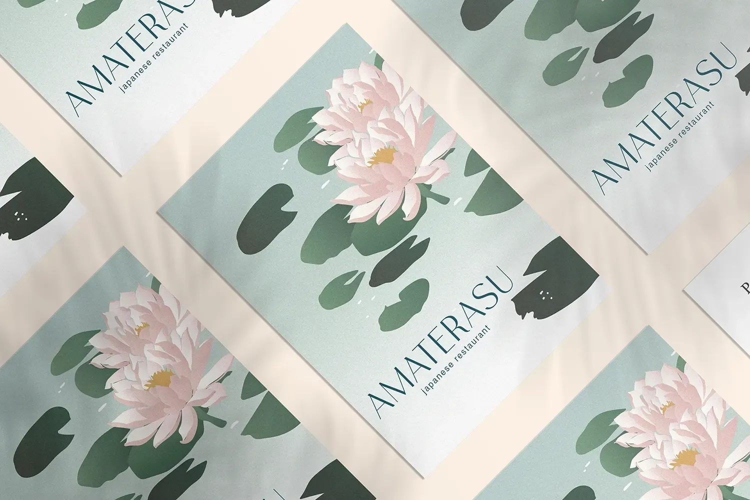
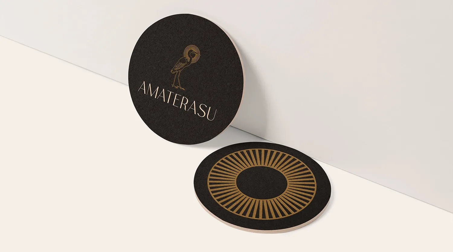
Amaterasu is a contemporary Japanese restaurant named after the sun goddess of Japanese mythology. The identity centres on the heron, an elegant bird that appears throughout traditional Japanese art. The result combines a modern aesthetic with cultural symbolism, reflecting the refined character of the restaurant.
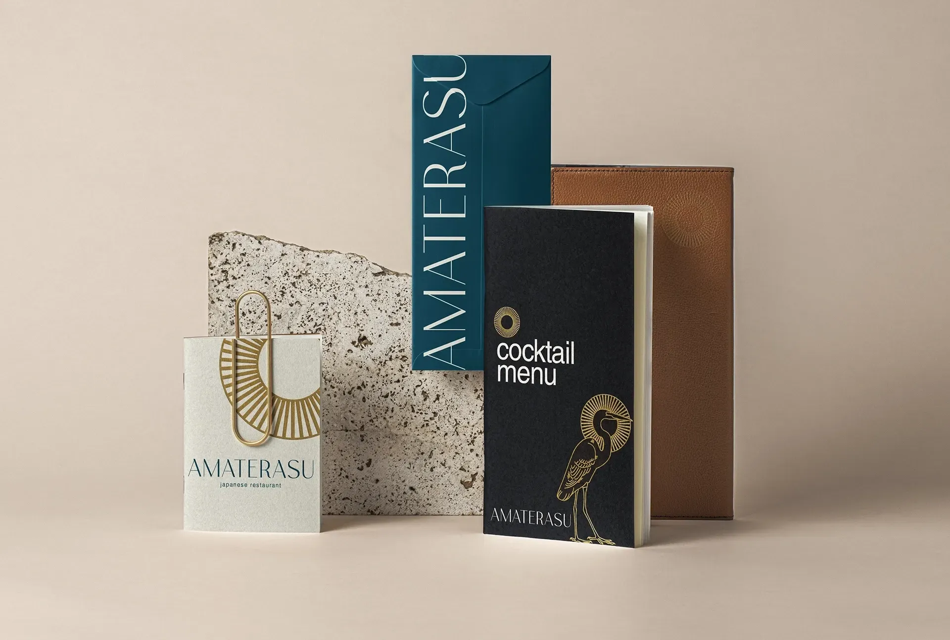
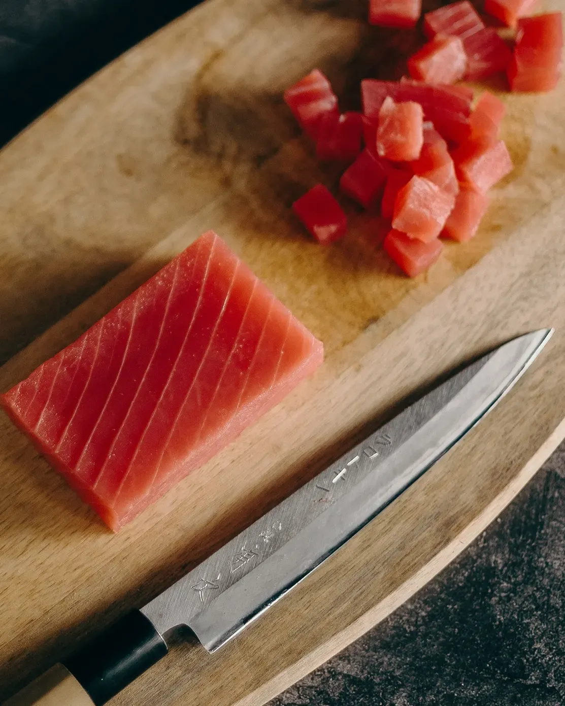
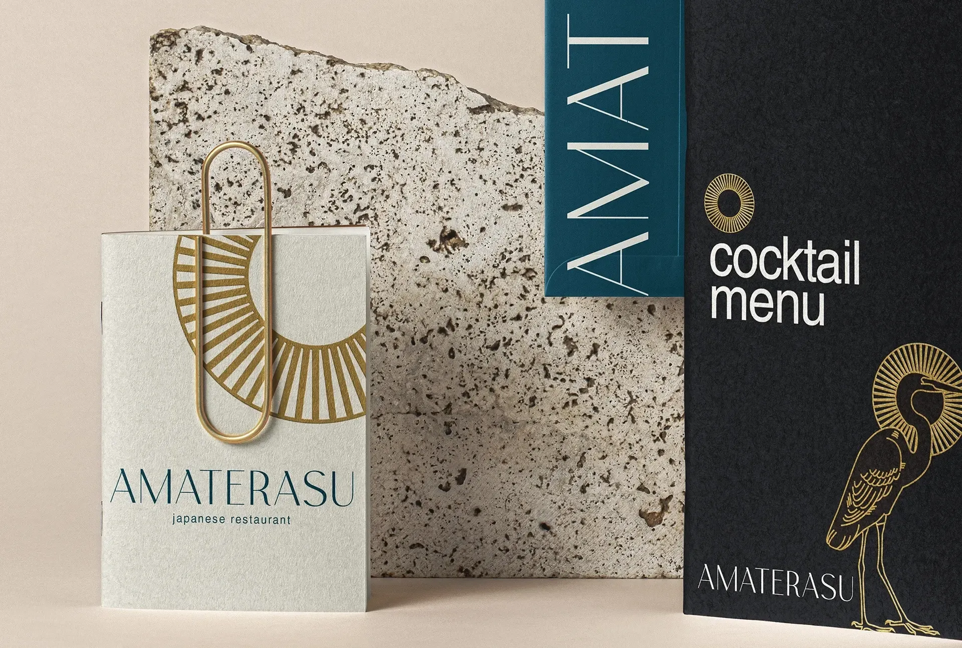
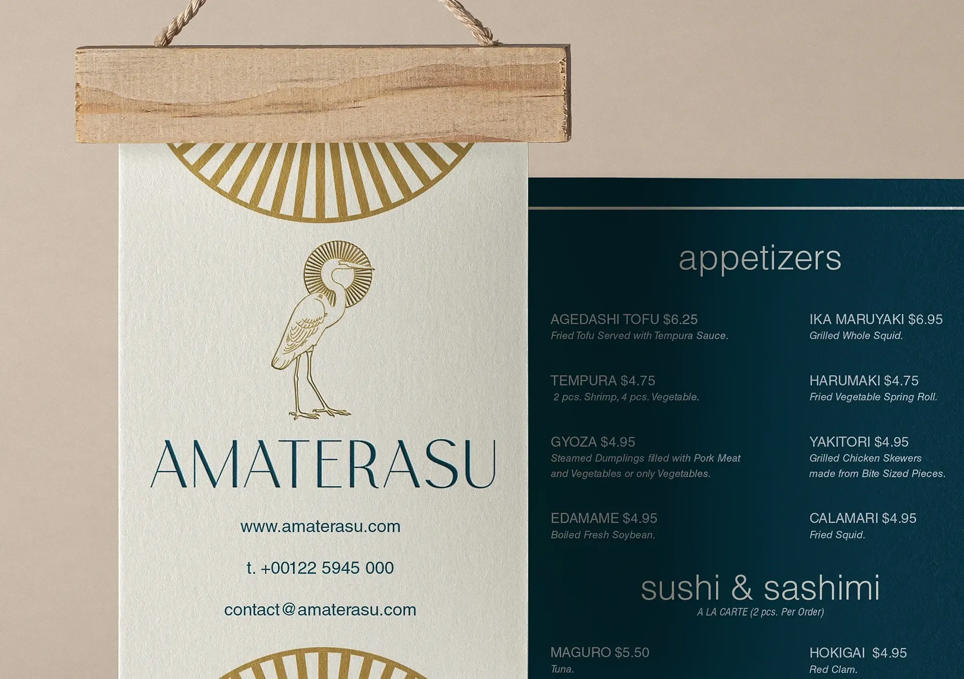
Amaterasu visual identity applied, image 1.Amaterasu visual identity applied, image 2.
Amaterasu visual identity applied, image 3.Amaterasu visual identity applied, image 4.
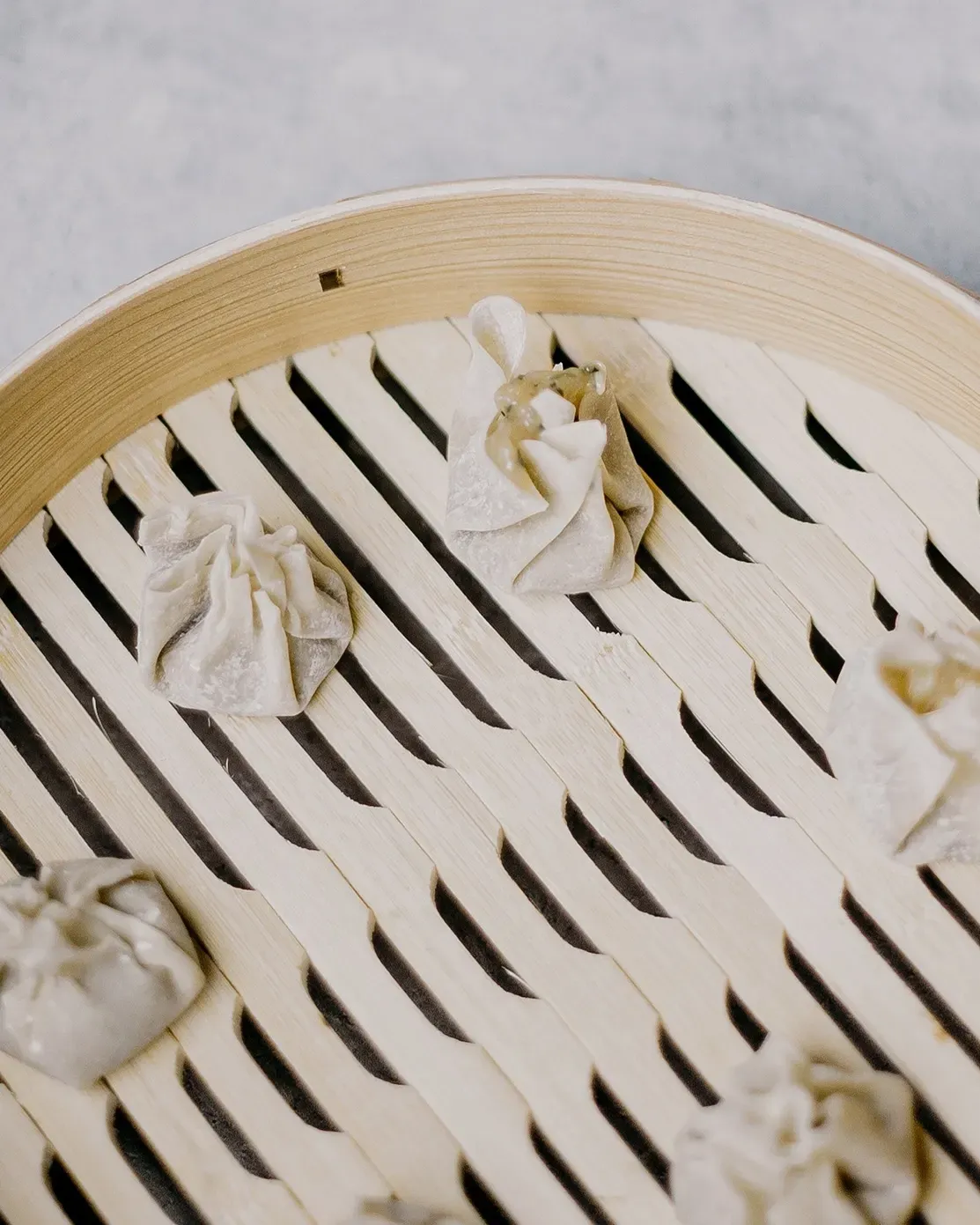
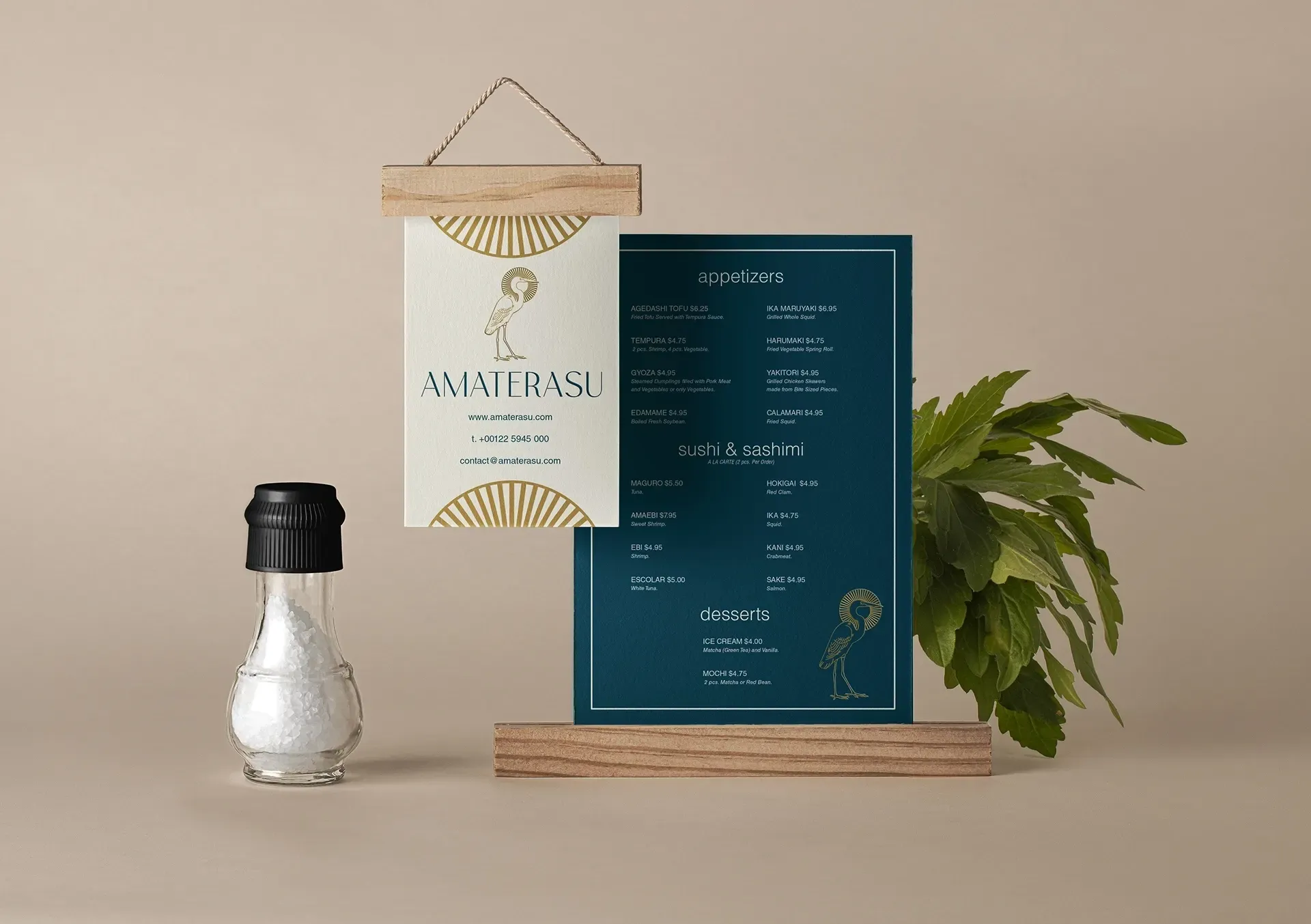
Amaterasu visual identity applied, image 5.
Amaterasu visual identity applied, image 6.Amaterasu visual identity applied, image 7.
Amaterasu visual identity applied, image 8.Amaterasu visual identity applied, image 9.Amaterasu visual identity applied, image 10.Amaterasu visual identity applied, image 11.